
Handling Asymmetry in Logo Design
I recently designed a logo for Swish:

We wanted the logo to feel modern, yet playful, so I designed a simple icon and used a clean, iconic font.
The only problem? The word swish is relatively asymmetrical. The word ends on an ascender and has no descenders.
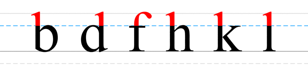
Ascenders are the parts of certain letters that extend above the baseline.
While this looks fine with plenty of whitespace, it starts to look strange in headers, where whitespace can be somewhat limited:

Notice that, while the baseline is centered, the actual text isn’t. Since this is an image, we’ll run into issues when we export the image to use on our site. Unlike text, HTML centers images according to their real dimensions.
If our text also had a descender, this wouldn’t be a problem:
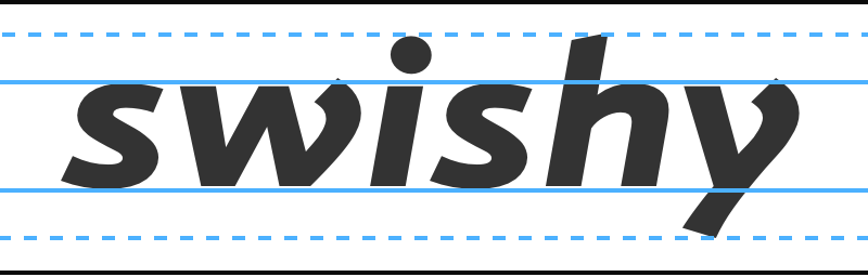
Unfortunately, ours doesn’t. One obvious solution is to make the entire word uppercase, but for a variety of reasons we didn’t want to do this. Instead, to make the text appear vertically center, I discovered a nice trick.
Add an invisible block below your text that’s equal to half the height of the descender:
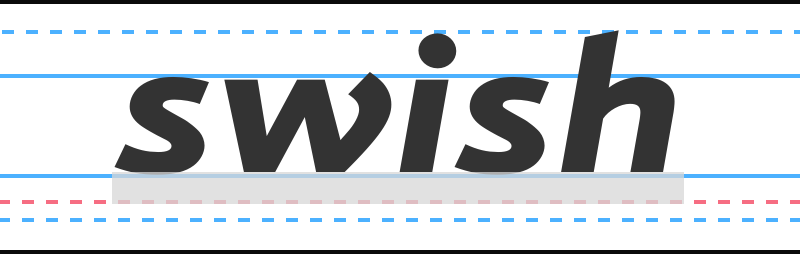
Group that invisible block with the text, then just center the group, and voila:

The text now appears to be centered appropriately.
I’m sure some designers will quibble with this method, but it seems pass the eyeball test for most people.